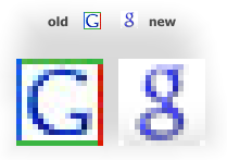
Regular users of Google properties will have noticed that the Google favicon has changed. Here's a side-by-side comparison from
blogoscoped.com.
The old icon reflected Google culture as I saw it, colorful, yet professional. This new logo drops the color scheme and switches to a lowercase "g". It's the sort of favicon I would expect on a kids-oriented site. If their goal here is to appear as an "underdog"--as suggested by the blogoscoped.com article--then they are seriously misreading their audience.
Maybe this will grow on me, but it had better start growing soon, 'cause at the moment it is nothing more than an eyesore on my bookmark toolbar.


No comments:
Post a Comment